Banner blindness refers to the phenomenon wherein a website visitor consciously or unconsciously ignores banner-like information, resulting in them frequently being distracted by other content found on a page.
According to Statista, ad spending for digital marketing for 2021 is predicted to reach $463,814m in 2021. This statistic means that most digital marketers are wasting their investment on ads that people will never click on (unless by mistake). And it is the same with mobile ad banners, up to 50% of clicks on mobile ad banners are merely a result of accidental taps.
The Common Causes of Banner Blindness
- Copying Brand Competitors: This results in ads within the same industry using similar styles and patterns. Using this templated format will visually register as an ad from a mile away.
- A Repetitive Layout: At first, using photos of a person with nicely-placed text always seems like a no-brainer go-to. But with continuous use after a short period of time, visitors learn to filter this layout style as an ad.
- Stereotypical Stock Images: Facebook is full of organic, imperfect photos shared by people. If you compare that side-by-side with a highly polished, professional-looking stock image, it can easily be identified and assumed to be an ad.
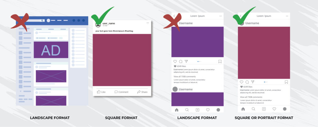
- The Landscape Format: FB Ads are usually laid out in landscape orientation. When Instagram ads came along, advertisers simply applied the same for them. Since typical images on Instagram are either square or portrait, landscape ads easily stick out.
- Overly Bright & Loud Graphics: Advertisers often make the mistake of thinking that it is the best way to stand out. It does – but in the wrong way. It instead screams, “Hey I’m an AD, ignore me!”.
How Can Ads Stand Out – In A Good Way?
1. Steering Clear of the “Ad” Look: Create graphics with visual elements that are uniquely interesting and cater specifically to your target audience. Veer away from bright coloured images and text.
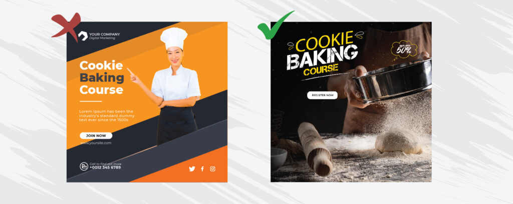
2. Simple Design with Organic/Natural Photos: If you want to teach people how to bake chocolate chip cookies, and your target audiences are people actively looking to learn this, displaying an authentic photo of a person baking chocolate chip cookies will easily grab their attention.
3. Design Hierarchy: Place your design elements in starting with the most important to the least.
4. Using Trends: Have a look at what is happening organically in social media. Stay updated on them as they often make excellent visuals to use in your ads.
a. Memes are incredibly popular and increasingly significant, it is important to recognise that a lot of people have done really well in using memes on Facebook.
b. Observe trends on other platforms and consider bringing them onto Facebook. Some examples include Youtube thumbnails, TikTok and Instagram video trends.
5. Native Formats for Dimensions: Avoid landscape and stick with square or portrait instead.
6. Catchy CTA’s: Word them out creatively, but also ensure that they clearly convey your message. A successful CTA will easily guide visitors to take the desired action.
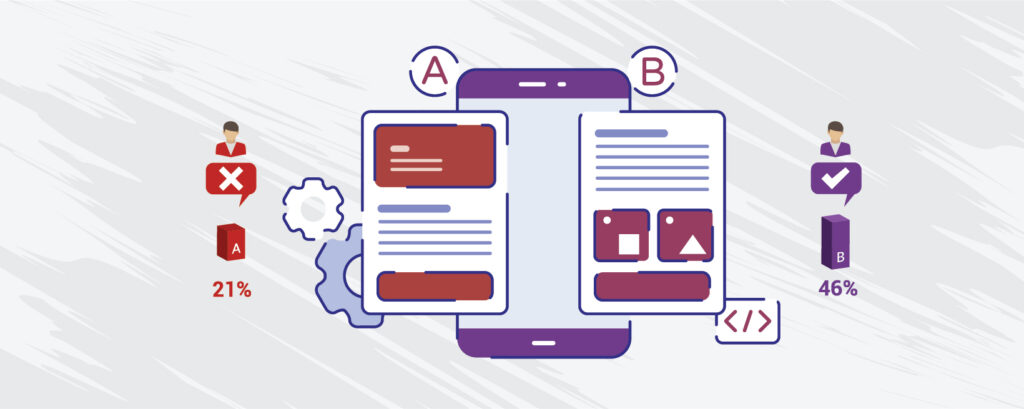
7. A/B Testing: Use 2 different ad design options and see which of them receive higher engagement. Run the campaign for two weeks or more to be able to compare their effectiveness.
PUTTING IT ALL TOGETHER
Overcoming banner blindness all comes down to careful planning and strategy. So be sure to choose your social media channels wisely and remain clear on your campaign objective. At the end of the day, a great social media ad design attracts the right kind of attention, accurately represents your brand, and also clearly communicates its story.
With all these tips in mind, it is ultimately up to you to decide and find the most effective design for your campaign.
A/B testing with your ad variants of choice will be the best way to evaluate which types perform best. Repeat the process with different variants and take note of what you learn each time, and apply as needed to future campaigns.
There is always much to explore and discover through careful research, trial and error, and constant improvements. The digital space continues to evolve and so should we – to be able to get the most out of what it has to offer today, and in the years to come.
Sources:
https://userguiding.com/blog/banner-blindness/
https://www.youtube.com/watch?v=NrfGbw9-Zb0